Brainblast · Brand guidelines
Brand
The colors we use, what each one is for, how our interface is built, and how we set type. 41 colors across 8 themes. Click any swatch or value to copy it.
Identity
Foundations
Brainblast has no single brand color. It has a closed palette and a set of roles that bind those colors to intent — because a learner can repaint the whole app from Settings, and every screen has to keep working when they do.
Palette
A closed set of named colors. Nothing above this layer invents a color; every theme picks from here.
Roles
Palette colors assigned to jobs — surfaces, text, buttons, status, brand. Every theme fills the same roles, so swapping one repaints the app without redesigning a screen.
Components
Buttons, cards, and text ask for a role, never a specific color. A component that hardcodes a color is the one mistake this system cannot absorb.
Two consequences worth internalizing. A hardcoded color is the one violation that cannot be corrected later — it survives every theme switch and breaks in exactly the themes nobody tests. And the palette is a closed set: if a design needs a color that is not on this page, the fix is to add it here, not to use it once.
Color
Palette
The 32 colors light and dark draw from, grouped by family. These are the ground truth — every role, button, and state on this page resolves to one of them.
Neutrals
The spine of every layout. Neutral 800 is the default text color; Neutral 50 is the grouped-background gray.
Neutral 50
Neutral 100
Neutral 200
Neutral 400
Neutral 600
Neutral 800
Yellows & oranges
Streaks, energy, and warnings. Orange 400 is the streak flame — the one place the app leans warm on purpose.
Yellow 50
Yellow 200
Yellow 400
Amber 400
Orange 400
Orange 100
Orange 500
Amber 600
Orange 600
Greens
Correctness and progress. Green 500 is the single loudest signal in the product.
Green 500
Green 700
Blues & cyans
Actions and the player's own identity. Blue 500 is the interactive blue; Blue 700 is the depth beneath it.
Blue 50
Cyan 100
Blue 300
Blue 500
Blue 700
Blue 900
Purples & pinks
Opponents, selection, and Pro. Purple 500 is the default selection tint.
Pink 300
Purple 300
Purple 500
Purple 700
Reds
Wrong answers and destructive actions. Red 500 is the miss.
Red 50
Red 200
Red 400
Red 500
Red 600
Color
Accent scales
The palette groups into six five-step ramps. A component asks for a step by name, not by hex, so the same button works in any accent.
| Accent | light | soft | base | strong | deep |
|---|---|---|---|---|---|
| blue | Blue 50 | Cyan 100 | Blue 500 | Blue 700 | Blue 900 |
| purple | Pink 300 | Purple 300 | Purple 500 | Purple 700 | Purple 700 |
| yellow | Yellow 50 | Yellow 200 | Yellow 400 | Amber 400 | Amber 600 |
| orange | Orange 100 | Amber 400 | Orange 400 | Orange 500 | Orange 600 |
| red | Red 50 | Red 200 | Red 400 | Red 500 | Red 600 |
| green | Green 500 | Green 500 | Green 500 | Green 500 | Green 700 |
light
Tinted fills and pale backgrounds behind the accent.
soft
Hover and secondary surfaces.
base
The accent itself — fills, icons, and strokes.
strong
Pressed states and text on light fills.
deep
The extrusion under a button in this accent.
Neutral scale
The neutrals keep their original animal names, running lightest to darkest. These six are still referred to by name in day-to-day design conversation.
Polar
Squid
Swan
Hare
Wolf
Eel
Color
Legacy names
The palette was originally named after animals. Numbered names replaced them, but every old name still resolves, and content authored against them is still in circulation.
These names still resolve to a current color. They are not decoration — existing question content was authored against them, so retiring one would silently change how that content renders. Treat this table as a live contract, not as history.
polar
→ Neutral 50
squid
→ Neutral 100
swan
→ Neutral 200
hare
→ Neutral 400
wolf
→ Neutral 600
eelblack
→ Neutral 800
canary
→ Yellow 50
duck
→ Yellow 200
bee
→ Yellow 400
lion
→ Amber 400
camel
→ Amber 600
cheetah
→ Orange 100
fox
→ Orange 400
monkey
→ Orange 500
guineapig
→ Orange 600
owl
→ Green 500
treefrogdarkgreen
→ Green 700
iguana
→ Blue 50
beluga
→ Cyan 100
bluejayskyblue
→ Blue 300
macaw
→ Blue 500
humpback
→ Blue 700
narwhal
→ Blue 900
starfish
→ Pink 300
beetle
→ Purple 300
bettaviolet
→ Purple 500
butterfly
→ Purple 700
walkingfish
→ Red 50
flamingo
→ Red 200
crab
→ Red 400
cardinal
→ Red 500
fireant
→ Red 600
Color
Roles
What a component is allowed to ask for. Everything on screen references a role, never a specific color — which is what lets a learner repaint the app without anything breaking.
Surfaces
Backgrounds, lightest to heaviest.
- Page
- The screen behind everything.
- Card
- Standard card fill.
- Elevated
- Raised surfaces — sheets, menus, popovers.
- Grouped
- Inset list backgrounds, the way settings rows are grouped.
- Scrim
- The dimming layer behind a modal.
- Display
- The hero backdrop. Several themes make this a gradient rather than a flat color.
Text
Four levels of emphasis plus one for overlays.
- Primary
- Question stems, headings, answer choices.
- Secondary
- Supporting copy and metadata.
- Tertiary
- Placeholders and disabled labels.
- Inverse
- Text on an inverted surface.
- Overlay
- Text over imagery or a colored fill — always readable.
Button
Fills and their matching labels. See Depth for the geometry.
- Primary background
- The main call to action.
- Primary foreground
- Label on a primary fill.
- Secondary background
- Lower-emphasis action.
- Secondary foreground
- Label on a secondary fill.
- Play background
- The Play button — deliberately separable from primary.
- Selected background
- The depth layer beneath a pressed button.
Status
Three groups. Answer is the one learners see most.
- Success / warning / error
- Banners and toasts.
- Correct / incorrect
- Answer grading. Never themed away to something ambiguous.
- Online / offline
- Multiplayer presence dots.
Brand
How a theme identifies itself.
- Primary
- The theme's defining hue.
- Secondary
- Its supporting hue.
- Signature
- The accent reserved for moments that should feel special.
Progress, player, selection, border, shadow
The remaining single-purpose roles.
- Progress fill / track
- Progress bars and XP rings.
- Player you / opponent
- Head-to-head games. Must stay distinguishable.
- Selection tint
- Selected rows and chips.
- Border
- The only border color a theme defines.
- Shadow
- The only shadow color a theme defines.
Roles are defined once and then scoped per area of the app, so a screen can diverge without forcing a redesign everywhere else. Two already do: the home screen adds its own streak color, and the game screen keeps a fixed battle palette that deliberately ignores the theme so the heads-up display looks the same everywhere.
Color
Themes
Light and dark. Both fill exactly the same roles, so a screen designed against one already works in the other. Pick one to see every role resolve.
Daily streak
12 days · 340 XP
White · Light · the default
Page
Card
Elevated
Grouped
Text primary
Text secondary
Text tertiary
Button primary
Border
Correct
Incorrect
Progress fill
Brand primary
Brand secondary
Brand signature
Selection tint
Form
Depth
Nothing in Brainblast is a flat rectangle. Buttons are extruded solids with a visible side face, and pressing one moves it — the face travels down onto its own shadow rather than fading or scaling. This is the single most recognizable piece of the interface, and it is not optional on new controls.
Buttons
Press any of these — they are the real control, built to the numbers below.
The action blue over its own fixed depth shade. Both are named colors, not a computed darkening.
An accent's base step over its deep step — the pattern every accent follows.
Red 500 over Red 600.
A white face with a 1.5pt border and a neutral extrusion, for lower-emphasis actions.
Geometry
The numbers every button is built to. New controls match these rather than approximating them.
Height
48pt
Corner radius
14pt
Depth
6pt
Side padding
18pt
Label
17pt · bold · rounded
Shadow
blur 7, offset 5
Pressed scale
0.985
Press
0.1s ease-out
- The depth layer is a separate solid shape, not a blurred shadow. A soft shadow reads as a floating card; a solid side face reads as a physical key.
- The face travels the full depth offset on press and the ambient shadow is removed at the same instant, so the button appears to land.
- Depth color is the accent's deep step — never black at low opacity, which muddies on colored themes.
- Press is 0.1s ease-out. Slower feels mushy; faster reads as a glitch.
- The whole control also scales to 0.985 — small enough to feel like give, not a bounce.
Level pucks
Home level buttons use the same idea with more geometry. Each puck is one shared shape recolored from a four-tone set, so a single asset covers every subject and state. All four tones are derived from one tint by shifting saturation and brightness, which is why a new category needs one color rather than four.
Press one. These are the shipped shapes, recolored per level.
bottom
brightness − 0.18
Bottom puck face — the extrusion the cap sits on.
top
the tint, unchanged
Top puck face. This is the color a learner reads as the level.
stroke
saturation − 0.15, brightness + 0.06
Ring stroke around the cap, and the base of the crown.
highlight
saturation − 0.30, brightness + 0.12
Crown highlight. Completed state only.
The four colors below are the tone roles. At render time each is replaced with the tone derived from the level's own tint, so the same shape serves every subject.
Identity
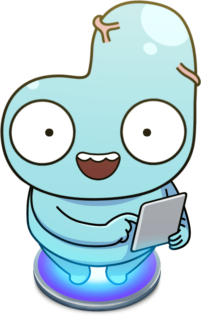
Derd
Derd is our mascot and the most reused piece of art we have — onboarding, streaks, results, widgets, and the daily puzzle. The costume changes constantly; the construction underneath never does.
Angle
The pose above is the reference. New art should match this camera before it varies anything else.
- Camera height Slightly above eye line, 15–20° down
- You should see the top plane of the platform as an ellipse and a little of the top of the head. Never a true top-down, and never from below — looking up at Derd makes him read as menacing rather than friendly.
- Body rotation Square to camera, or a shallow three-quarter
- Shoulders stay roughly parallel to the frame. Past about 30° of rotation the head silhouette stops reading and the notch looks like a mistake.
- Face Always level to camera
- Even when the body turns or the pose is dynamic, the eyes and mouth face the viewer straight on. Derd makes eye contact.
- Light Above and slightly behind, favoring the upper right
- One large soft highlight on the crown plus a small satellite dot. Shadow is a cooler blue on the underside of the head, the arms, and between the legs.
- Grounding On the lit platform, or on nothing
- Either he stands on the glowing disc or he floats free with no cast shadow. A soft drop shadow on a flat floor is not part of the system.
Construction
What stays fixed no matter the costume.
Silhouette
A tall rounded lobe on one side with a lower brow on the other, separated by a step. The step is the recognizable feature — never smooth it into a dome.
Eyes
Two large white circles, outlined, set low and wide on the head. Pupils are small solid dots. Their size relative to the head is what makes him read as young.
Gills
Salmon-pink marks: a three-pronged one at the step, a two-stroke pair on the opposite side. They are the only warm color on the body.
Mouth
Open smile with a dark maroon interior and a white upper tooth band with a scalloped lower edge. Closed-mouth variants use a simple curve.
Outline
A dark warm brown, not pure black. Heavier on the outer contour than on interior lines, and it never disappears — Derd always reads as drawn.
Body
Pale cyan with a lighter crown and a cooler blue underside. Limbs are simple tapered tubes with four-fingered hands.
Don't
- Don't rotate past a shallow three-quarter, or the head step stops reading.
- Don't light from below or head-on — the crown highlight is what gives the body volume.
- Don't recolor the body per theme. Derd is the same cyan in every palette; only his costume changes.
- Don't place him on a flat drop shadow. Platform or nothing.
- Don't crop the head step out of frame in a portrait crop.
Identity
Typography
Two system faces doing two jobs, plus one custom face used sparingly. Display is rounded and heavy and carries the personality; body text is the plain system face so a reading passage looks like a reading passage.
Rounded
Blast through the SAT
Every headline, button label, score, and number. Rounded terminals are the closest thing Brainblast has to a brand typeface, which is why display carries the personality and body text stays neutral.
Text
The passage most strongly suggests that
Question stems, passages, answer choices, explanations. Set in the platform's own text face and sized by the reader's accessibility settings, so a passage stays comfortable at any size.
Funny Writing
wait, don't go!
The only custom typeface in the product. Used sparingly and at large sizes for handwritten asides, where a human aside should feel genuinely hand-written.
Specimens are set in the closest web equivalent. The rounded face renders natively on Apple devices; elsewhere it falls back to the platform sans, and Funny Writing is not loaded on the web.
Weights
How often each weight is actually used across the product — heavy is the house weight, not bold.
Heavy
194×The default. Headings, scores, most button labels.
Black
73×Large numbers and hero titles.
Bold
69×Regular button labels and row titles.
Semibold
52×Chips, badges, and dense labels.
Medium
14×Rare — secondary display labels.
Regular
3×Effectively unused. Use the text face at this weight.
Text styles
Sizes are points at the default accessibility setting. Body styles grow and shrink with the reader's text-size preference; the rounded chrome sizes stay fixed.
1480
Score
Rounded · 34pt · heavy
Projected scores and large numbers.
Your results
Large title
Text · 34pt · bold
Screen titles.
Weekly streak
Title
Text · 22pt · bold
Section and dialog titles.
Continue
Button
Rounded · 17pt · bold
The label inside every button.
Reading and Writing
Headline
Text · 17pt · medium
Row headings.
The passage most strongly suggests that the narrator has come to regret the decision.
Body
Text · 17pt · regular
Paragraphs, passages, and answer choices.
Correct — nice work.
Correct / incorrect
Text · 17pt · regular
Inline grading feedback.
Based on your last 20 questions
Subheadline
Text · 15pt · regular
Supporting copy under a heading.
Score projections are estimates, not guarantees.
Footnote
Text · 13pt · medium
Fine print.
Streak
Badge
Text · 12pt · semibold
Capsule badges, on a caller-supplied fill.
Updated a few seconds ago
Caption
Text · 12pt · regular
Metadata and timestamps.
Pro badge
The Pro stamp is the one piece of type with its own treatment, and the only place a gradient is applied to text. It marks a Pro entitlement wherever one appears — the paywall, gated actions, upsell surfaces — and it is always the same element so it reads as a single brand mark rather than a label someone styled.
- It is type, not a pill. There is no background fill and no container — the stamp is the word itself.
- Green to teal to blue, always left to right. The gradient never rotates and never re-orders.
- The white stroke sits behind the glyphs, and both stroke and shadow render outside the layout box. That overhang is what gives it the sticker feel — don't clip it.
- Stroke width, shadow radius, and shadow offset all scale from the font size. Set the size and let the rest follow.
- It reads "Pro", never "PRO" and never "pro".
Rules
- Display type is rounded and heavy. If a label looks like the system default, it is missing its rounded setting.
- Body copy scales with the reader's accessibility text size rather than a fixed size — question content has to stay readable.
- Numbers are rounded, heavy, and fixed-width so scores and timers don't jitter as they count.
- New text picks one of the styles above. Inventing a one-off size and weight is the same category of mistake as a hardcoded color.